
Playing with Shiny: MTG Design Trends
The challenge of data exploration frequently lies not in answering any specific question, but in the scope of possible questions which might be asked. Usual incentives promote us to analyze data in defense of a predefined narrative, but it can be just as valuable to construct methods for any user to conduct their own open ended exploration of the dataset. To do this requires interactivity with the user, which presents a substantially different challenge than what we usually face. I wanted to explore how to construct a simple Shiny app, which creates a slick and simple user interface for a given R program.
For an example open-ended data setting, I turned to one of my guilty pleasures, the trading card game “Magic: the Gathering”. Magic (for short) has been in continuous development since 1993. A crucial aspect of the game’s popularity is the near infinite customizability offered by the player’s decision to choose exactly which cards are included in their deck before each game. Thus, both the business model and the game’s lasting appeal is predicated on the regular release of new cards. In total, 19,989 unique cards have been created, although the frequent re-release of popular old cards means that the total number of cards chosen to be released in the last 25 years is around 35,000 (once including these repeats).
Thus, the total set of cards released creates a fascinating dataset. The philosophy behind Magic’s design has continuously shifted over this period, as new designers join and leave the team and the tastes of their audience adjusts with the times. Some of these shifts in design are well known, but closer inspection might reveal trends that are not frequently acknowledged by the designers. Of course, this represents the exact sort of open-ended problem outlined above, where the individual questions asked might be simple, but the breadth of possible questions is staggering. This is a prime setup for user interaction, rather than directly presenting the user with the figures that we choose.
Constructing the dataset
Before any work can be done in Shiny, we need a dataset to analyze. We thank the providers of the MTG-JSON project for their work in providing a complete dataset of all cards released. The cards are kept in JSON format, packed into sets (so that the set metadata can be stored), and listed within sets by cards. Each card in Magic follows a similar structure. It falls into one of several card types, has an array of attributes (from functional changes to its effect, to its collector number and name of the artist who drew its art), as well as a textbox which lists its specific effect. However, the JSON format makes sense over the rigid data frame structure because of the inconsistent formatting of cards throughout history. Magic stays fresh by following the mantra that “rules are made to be broken”. Thus, while each card has a corresponding “color”, after the first few sets, cards could have multiple colors. And as the game progressed, new card types were added, each with their own set of unique attribute data (beyond what would go in the text box of the effect). And eventually we saw the introduction of “split cards” and “double faced cards”, which require their own unique structure. Ultimately, this provides a substantial challenge to coerce into a regular data frame. While every card could be summarized by unstructured text, our analysis will hinge on being able to rely on consistent card structure. We only consider a subset of cards which follow consistent structure, focusing solely on “creatures”, which form the cornerstone of Magic (ignoring cards with irregular structure like flip cards). With this structure, it is straightforward to coerce the data to a data frame. We then use binary tags to mark whether a creature is each of the five possible colors, as well as whether it has one of about 40 different keywords of note. These keywords are simply noted in the textbox of the cards, so we must use careful regular expressions to ensure we only flag cards with the right keyword (for example, many cards use “flying” in their textbox to refer to a name, rather than the mechanic).
Shiny App
The first goal of the Shiny app (beyond the main purpose of trying to get a basic understanding of the capabilities of Shiny) is to analyze the shifts of design philosphy for Magic keywords. Wizards’ shifting position on card keywords are often publicly stated. They are open about which mechanics are “evergreen” (used and available in every set) and “deciduous” (available when needed), as well as which keywords are primary, secondary, or tertiary in each ofthe five colors (effecting the frequency with which they are used, as well as the rarity distribution). While these shifts are publicly discussed, it’s interesting to actually test how these changes manifest in the creatures printed, as well as consider whether we spot more subtle, unrecognized shifts.
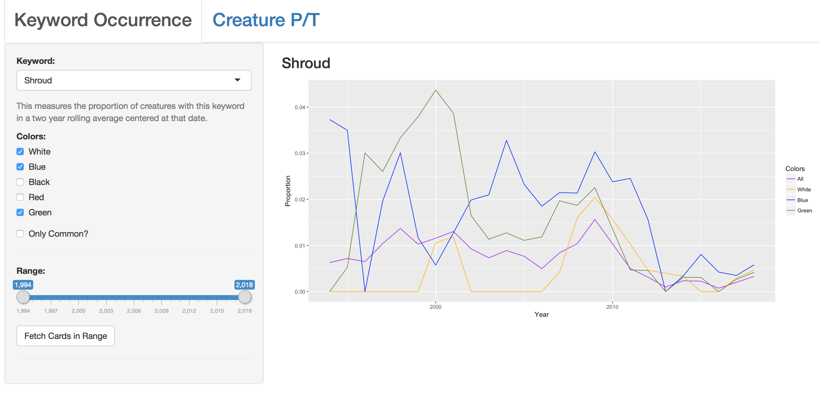
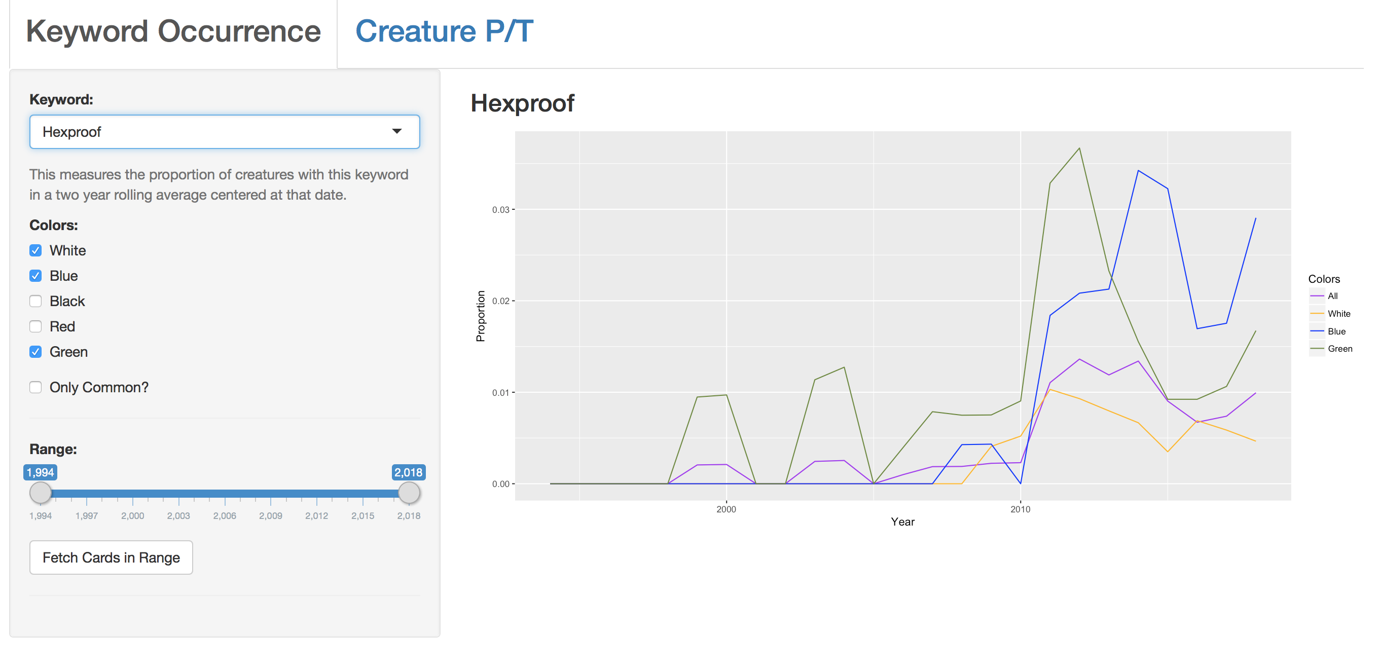
The app considers the two year rolling average of the frequency of the keyword’s usage (i.e. the number of creatures printed with that keyword over the total number of creatures printed). Then, we let it subset based on any selection of colors, as well as focusing only on the “Common” rarity, and plot the results. This toy app is quite simple, but it’s surprising how much work goes into ensuring consistent formatting for a plot when the inputs can vary so wildly. We then add some neat features such as selecting a range of years, and fetching all cards with that keyword during that range (which lets us examine suprising results more closely within the app). This makes it simple for a user to quantify the effect of certain shifts. For example, a controversial (and in my personal opinion, unfortunate) change was the shift from “Shroud” to “Hexproof” around 2010, which is easy to observe in the plots. The three colors which had Shroud in their arsenal see it nearly deprecated in 2010, while hexproof quickly becomes nearly as common as shroud previously was.
While the switch to Shroud to Hexproof exactly matches our intuition, this app can help us visualize more subtle shifts. It is widely known that “Protection from X” fell slowly out of favor over the years, due to its unintuitive definition and binary gameplay. However, there was no single point in time where this shift occurred. Protection originally occurred on over 10% of all white creatures, but with each successive year it became less prevalent, at a similar rate in its primary color as in the other 4. There waas likely no singular meeting that obseleted “Protection”, but piece by piece its role was shifted to other colors (culminating in Dominaria, where we saw more direct experimentation with “Protection” replacements with the “Hexproof from X” mechanic used on the knights). A similar plot can be shown for “Regenerate”, which suffered from similar issues from its unintuitive rules implementation.

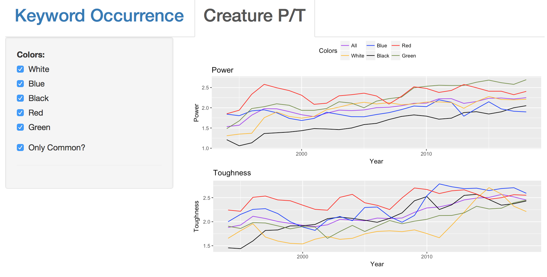
With this framework constructed, it’s fairly trivial to analyze other shifts in design philosphy. As proof of concept, we consider how the power and toughness (the base statistics) of the average creature have shifted over time. We see that creatures are getting larger across the board (particularly at common, which has the greatest impact on limited environments). However, the difference between the colors was most pronounced at the start of the game (the meanpower of a white or block common was less than 1.3, while red and blue were around 1.8). However, it’s important to recall that general visualizations like this can easily mask specific causes. For instance, it might seem surprising that green (which was known for its large creatures even early in the game’s history) didn’t have a high common mean power at the game’s inception. But Alpha and Beta contained a number of walls at low rarities, many with 0 power, which likely influences the results. Over time, the differences between the colors has softened, likely as Wizards has shifted their attention to ensuring balanced limited environments.
I’d prefer to post the project itself, because for Magic fans it’s genuinely interesting to play around with the options and see what pops out at you. The beauty of an interactive approach is that you don’t know what you’ll find in advance, but exploration lets you cover lots of ground. However, I don’t know of a free way to upload a Shiny app to the web. This was simply a way to get a taste for working with Shiny. I’d like to come back to this once I have some better ideas for practical needs that could be solved with this sort of app sorting through the Magic cardset, because the hard work is done, and implementing a specific tool is pretty straightforward from here.